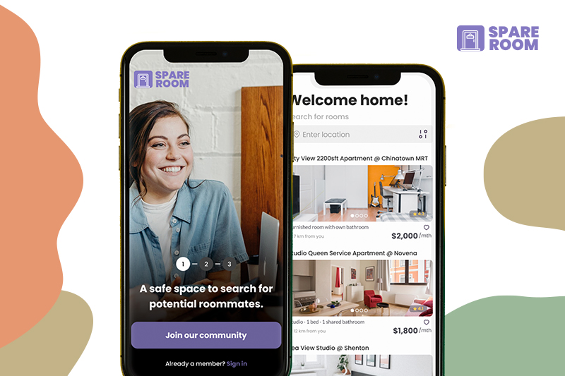
Spare Room
User Interaction, User Experience, User Research, Art Direction
The Brief
Finding roommates outside of your friend group is a lengthy and frustrating experience. People turn to Facebook Groups or Gumtree only to spend weeks or months in search of compatible roommates. Design a mobile application for the millennials aiming to solve this problem and make it safe to find the ideal roommate in Singapore.
Project Type: Design Challenge/Individual Project
Platform: Mobile App
Timeline: 2 weeks
Target Market: Millennials of Singapore
My Role: User Research, User Interviews & User Flow, Design Studio
Software Tools: Google Forms | Miro | Figma
UX Tools: User Research | User Interviews | Competitive Analysis | Affinity Mapping | User Persona | User Journey | User Flow | Wireframing | Design Studio | Usability Testing
Design Process
Design thinking is a human-centered approach to innovation that draws from the designer’s toolkit to integrate the needs of people, the possibilities of technology, and the requirements for business success.

Each phase of this process was fundamental to find a solution that was based on our user needs and not on own assumptions. We only had to trust the process and everything came along.
Understanding the current experience
User research
To understand what the existing experience of finding a roommate was like. I have interviewed users in coffee shops, talked to people with knowledge matching roommates. Here’s what I’ve got:
- Pictures worth a thousand words.
- Finding a roommate can possibly be one of the most stressful things you do when deciding to live independently. Pictures show information about a person’s character, hobbies and lifestyle. It is very important in accessing a potential roommate profile. People want to see that their potential roommate is just like them.
- Reach out to your friends
- “Looking for a roommate, check out my bio and hmu if you want to chat.”
- Roommate bios are a very convenient way to express yourself in one paragraph and to leave a first impression on your readers. With this information, the reader will decide whether they want to get to know you more in pursuit of a potential roommate.
User Interviews
In addition to the initial user research and assumption data, we have also ran face to face interviews with room seekers and landlords to get qualitative data. This is what they say:
- “Language can be a barrier preventing people to feel comfortable communicating with others.”
- “I have a busy schedule. I can’t arrange a meeting to view the living space with the roommate all the time.”
- “Texting people is such a tedious process”
- “I can’t seem to find someone with similar lifestyle as me”
- “I want a pet and I know it’s hard to find a roommate and place that wants/allows pet.”
After doing interviews I realized this is why UX research matters because when you have no clue about what you’re doing, you just have to listen to the people and everything will come clear.
User Survey
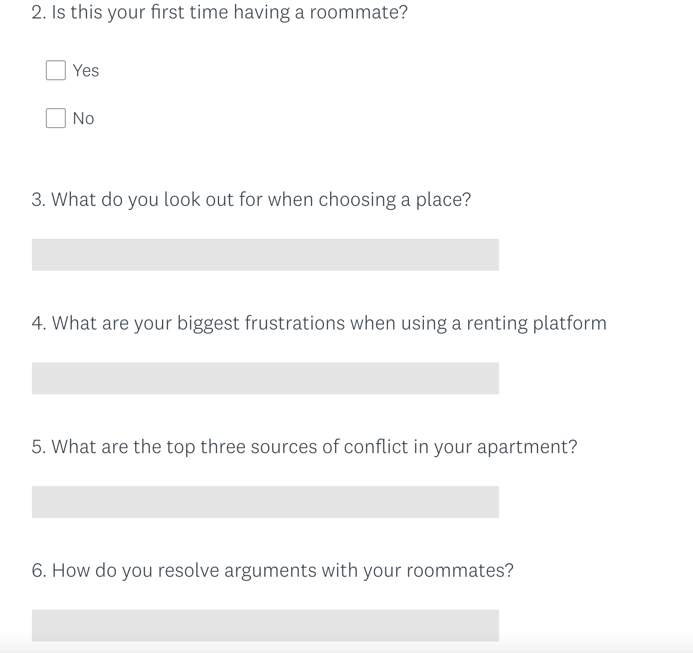
I wanted to learn what was going on behind the real users. I created survey which was shared on social media to understand their frustrations and pain points. Here is what I learnt:
- 84% use Facebook Group to look for a room
- 80% have mentioned that is time consuming
- 78% have mentioned there is a lot of scams
- 74% have requirements to feel comfortable to live with other people
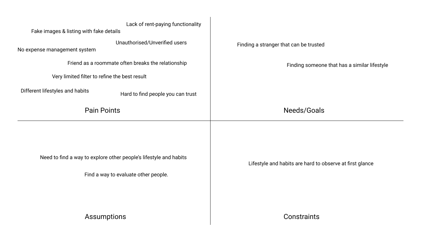
The Quadrant
Pain points
By mixing these 2 types of data our goal was to create the most accurate user personas possible. These are the qualitative feedback from users told us:
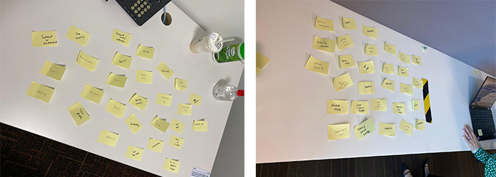
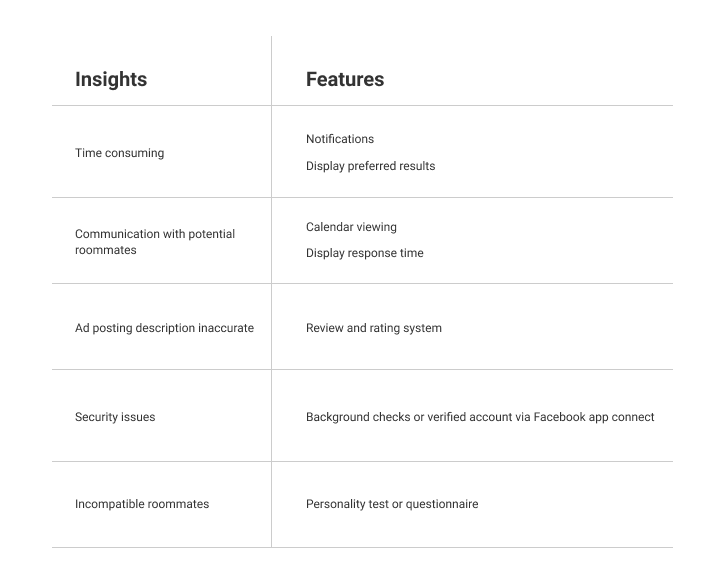
Affinity Diagram was useful to get all the information organized by topics and be visual to all analyze them. Using this tool made persona very easy to do, define what would be the more relevant information to include. The main insights:
- The process isn’t clear and fast.
- Lack of communication and notifications between tenants and landlords
- Inaccurate or not up to date postings
- Security issues
- Incompatible roommates
- Language can be a barrier preventing people to feel comfortable communicating with others.
Feature List
After conducting this research, we had enough insights to move to the planning phase. We took the user insights we previously discovered and turned them into features.
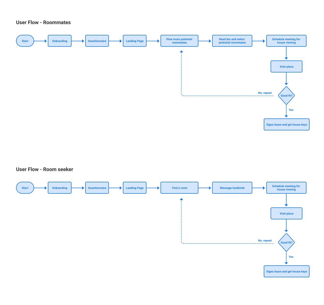
User flow - Roommate and Room seeker
Personas
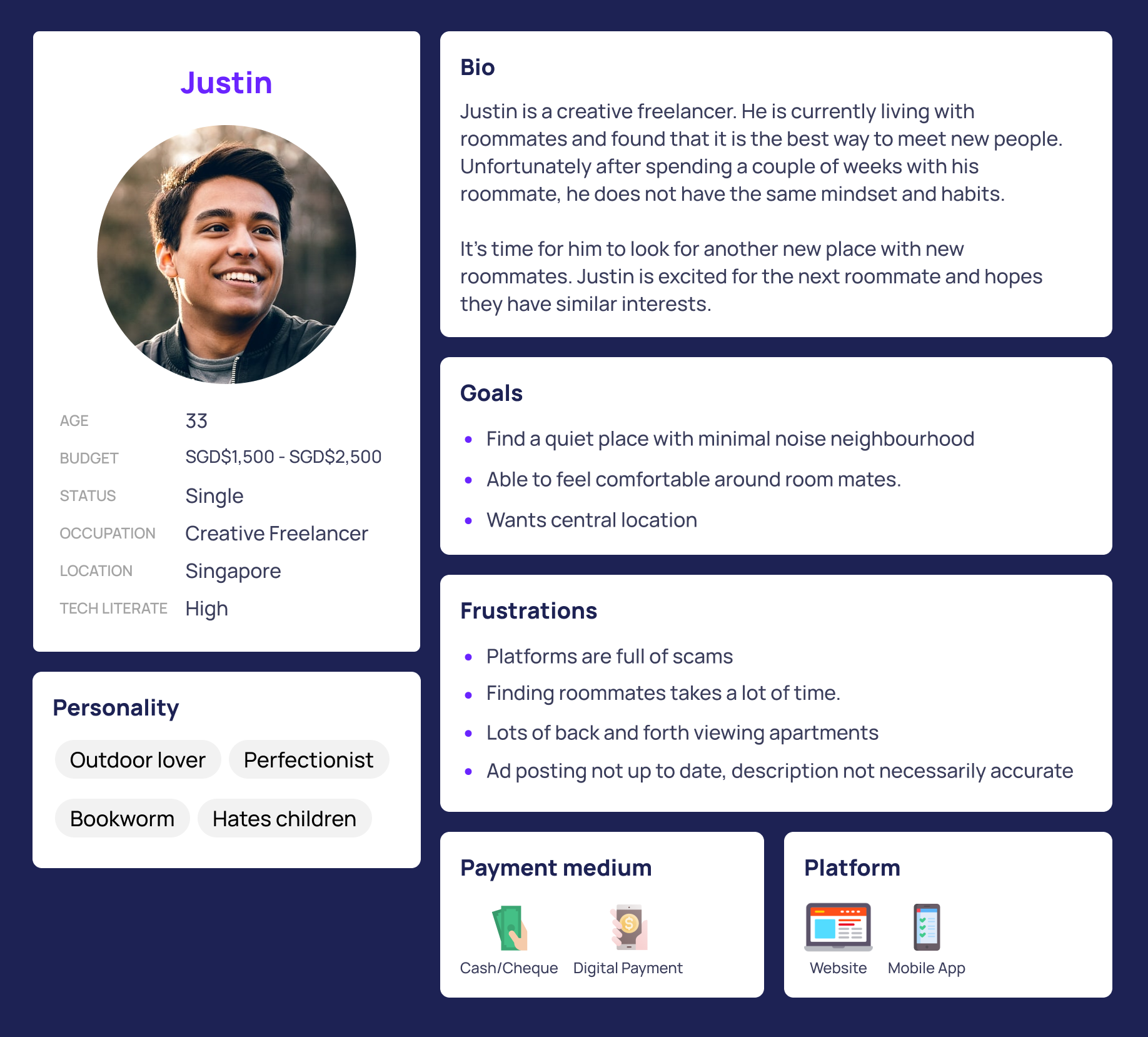
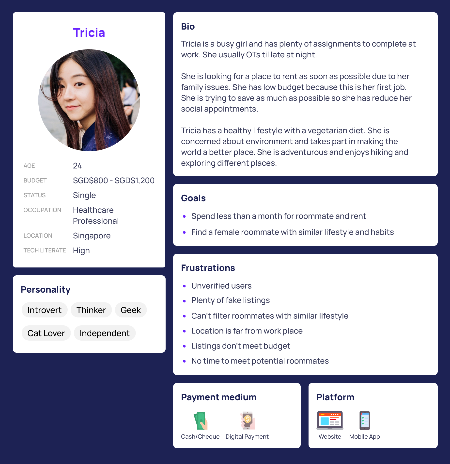
Based on the statistics that I collected, I created 2 user personas: Justin and Tricia.
The Competition
Competitive Analysis
To compare how similar services approach the room and roommate search, we also have run a competition analysis. Below references can be considered as big competitors in the same business:
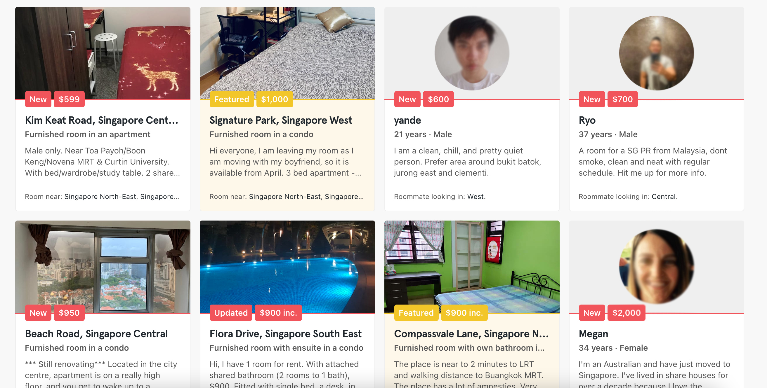
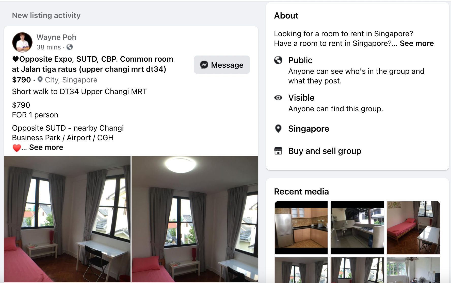
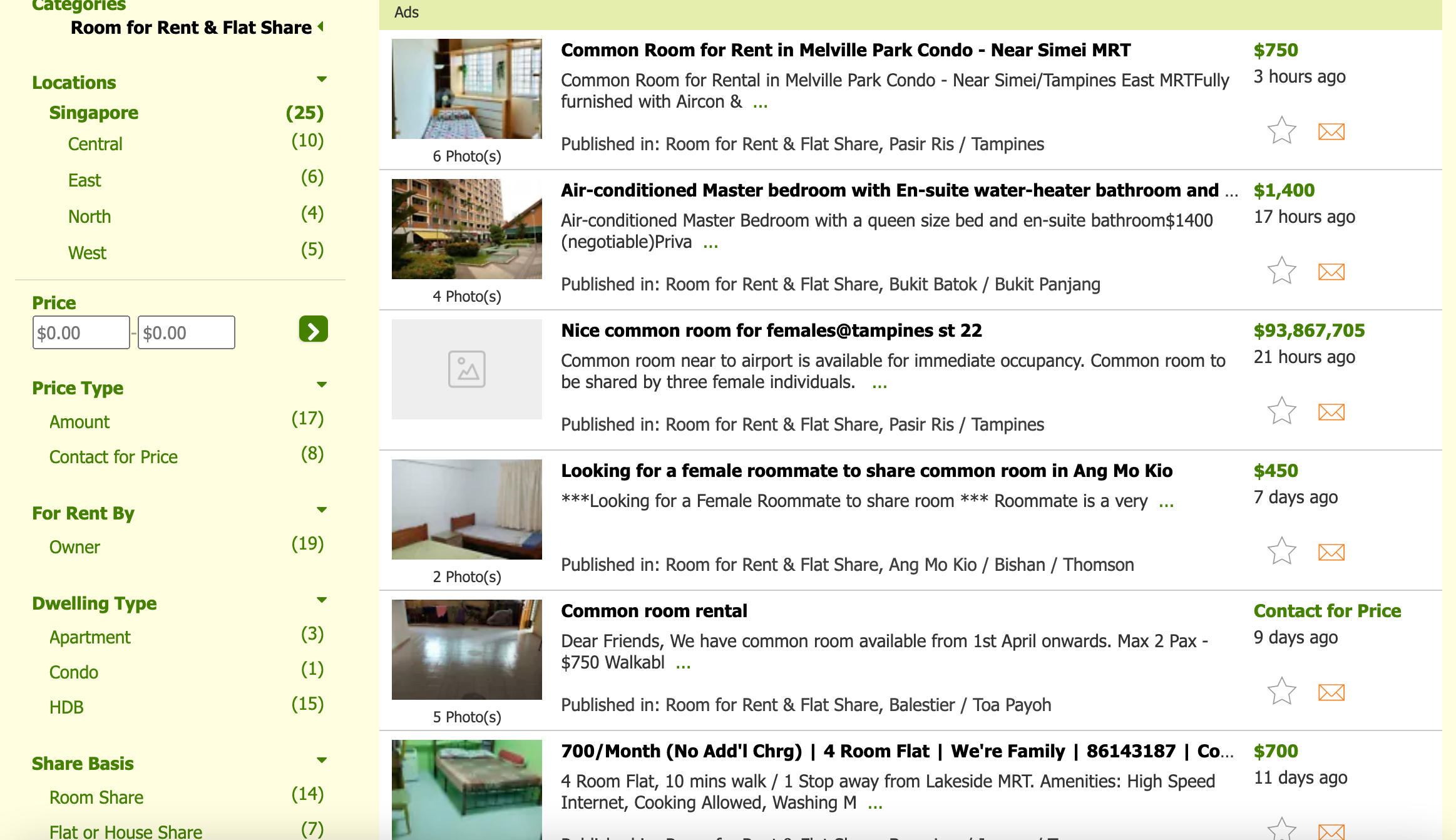
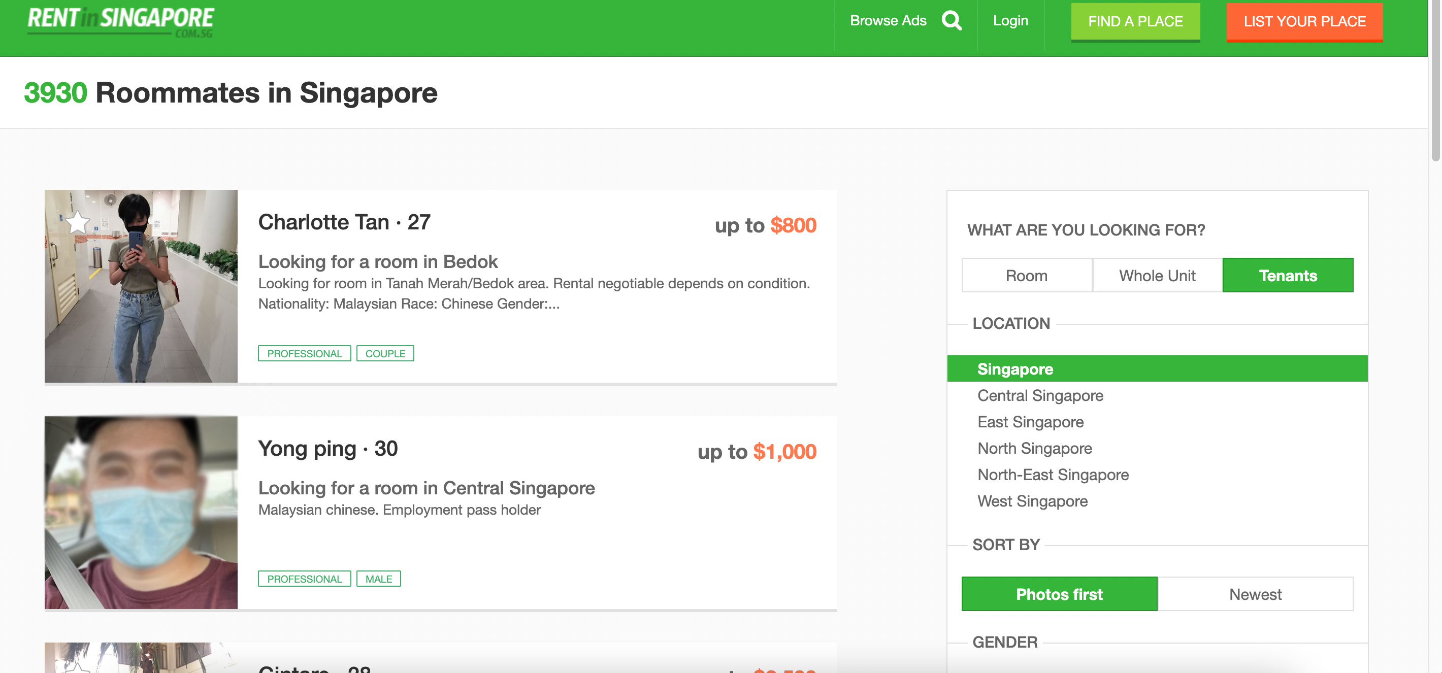
- Fake Images & Listing with fake details
- Very limited filter to refine the best result
- Unorganized listing
- No contact details of Landlord & Roomer
- No Booking System
- No Expense sharing System / Lack of Rent paying functionality
- Map or Nearby users cant be searched or connected
- Unauthorized/Unverified Users
- Landlord Rules book is not present
- Rooms features
- Price Range
- Property type
Design
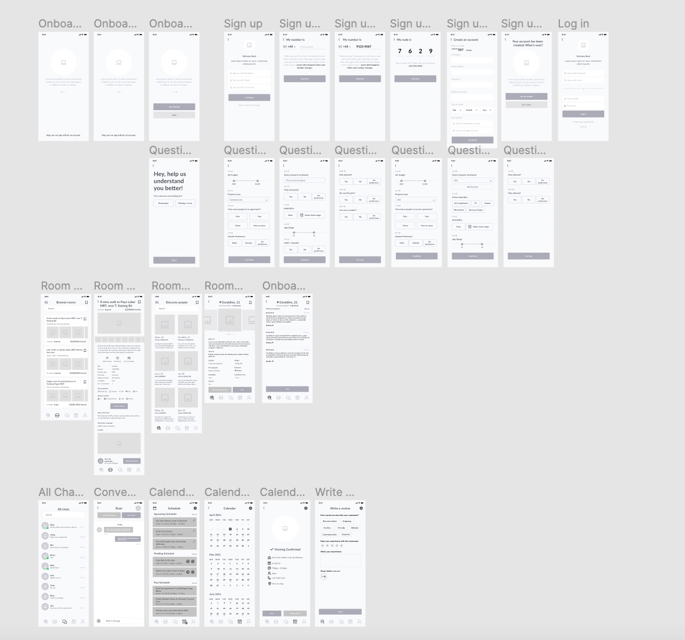
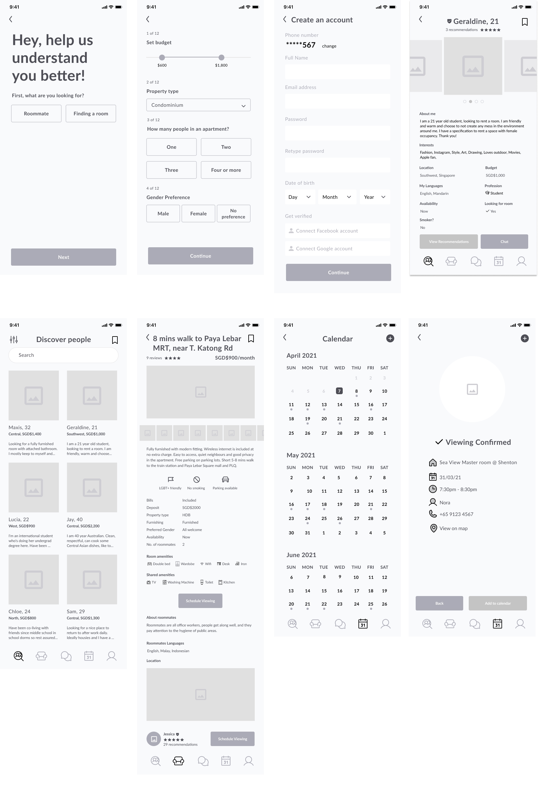
Wireframes
Wireframes are simply designed and they concentrate on layout, arrangement and information architecture. It focus on functionality, behavior, and priority of content. Once you have those things established, designing the product becomes a lot easier.
Another benefit of wireframes is that they give the users and clients an overview of what their website or application will eventually look like.
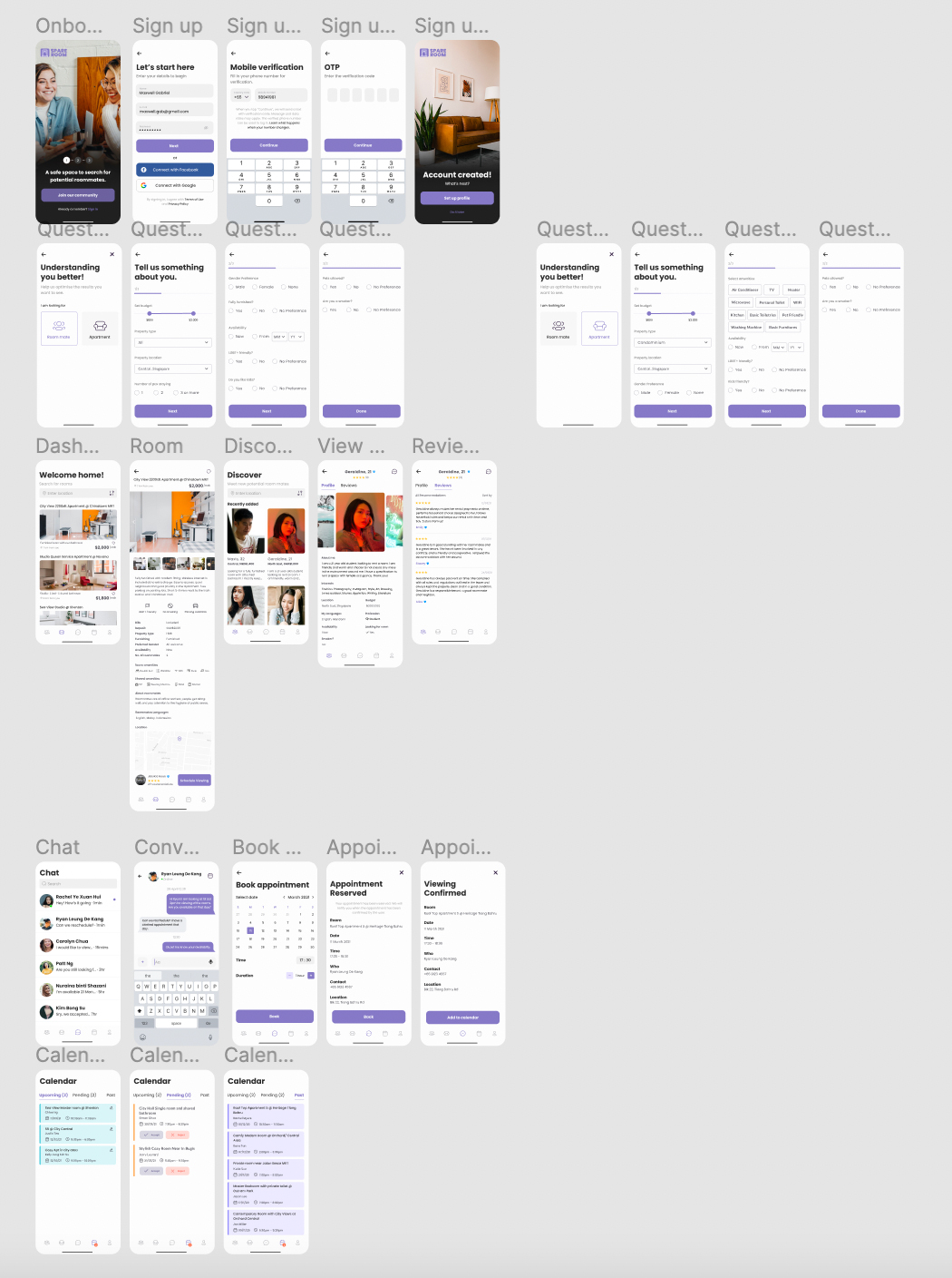
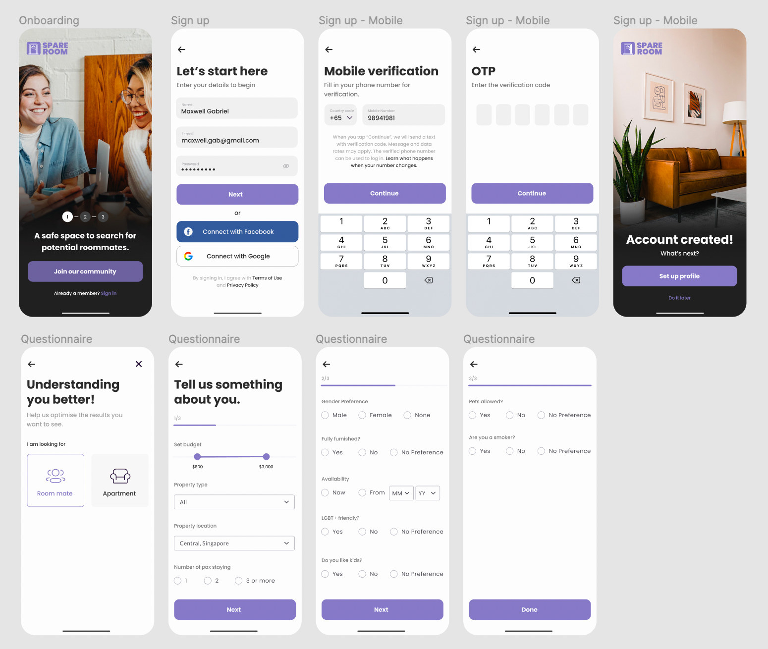
Mock Ups
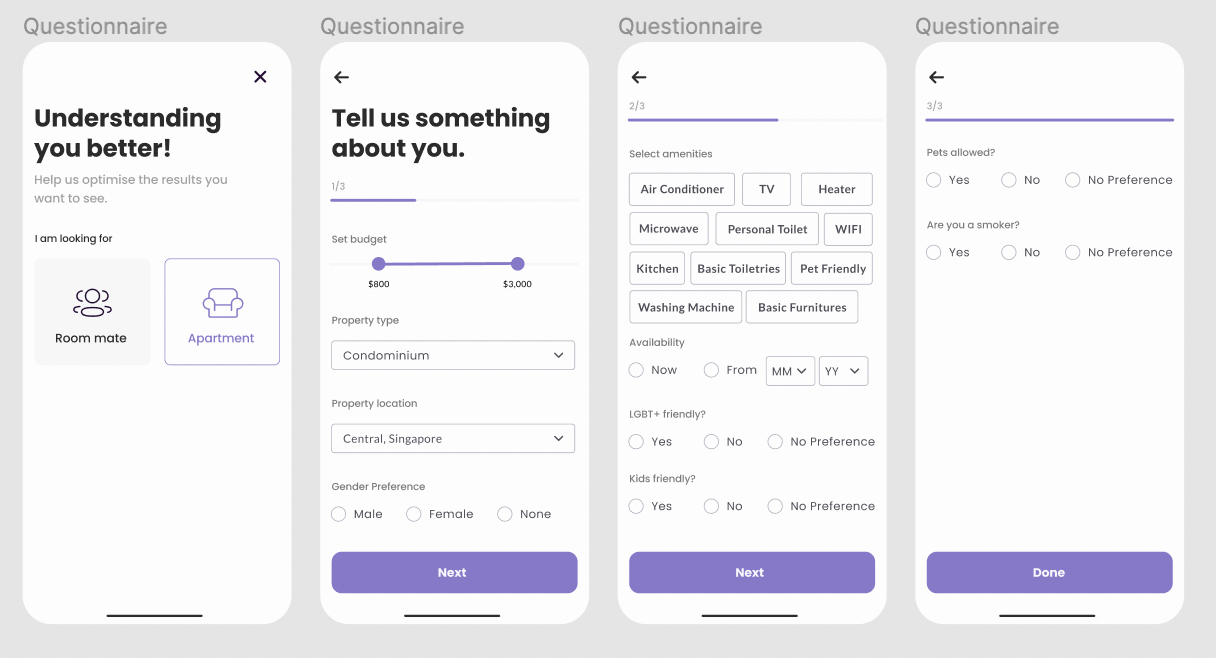
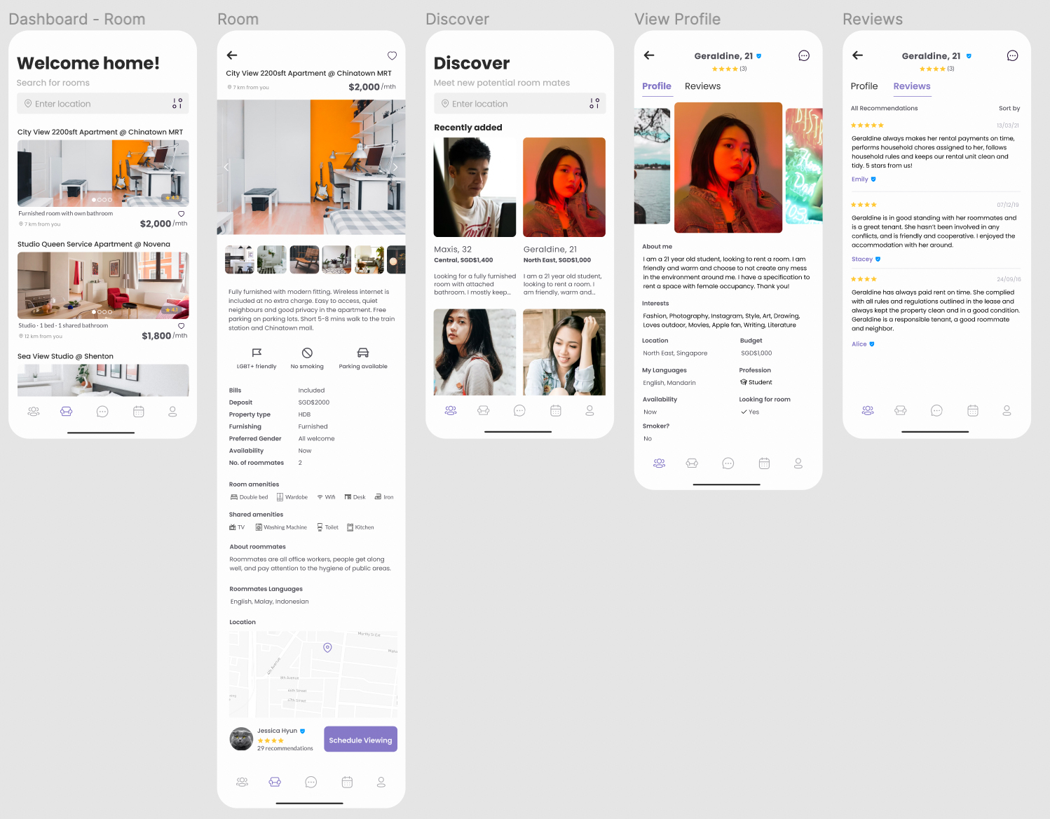
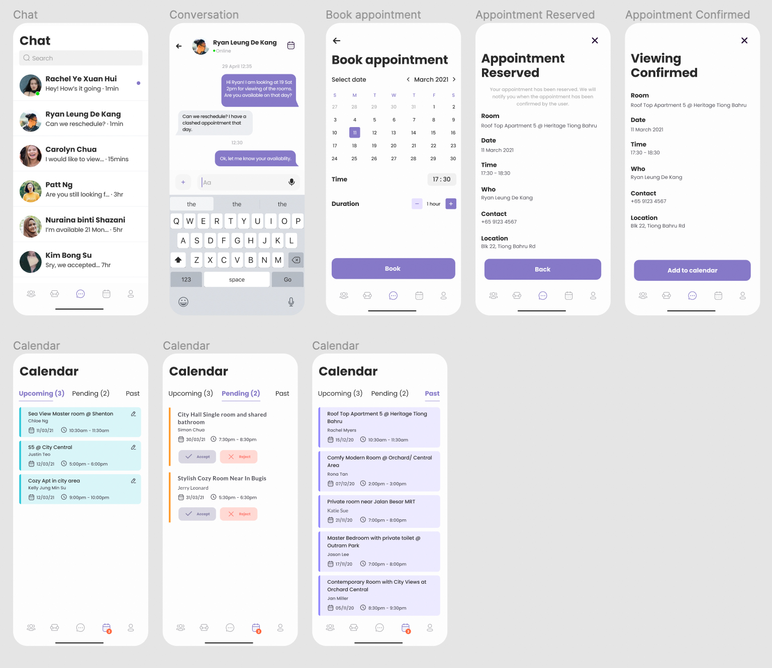
The goal of the final design is to make the roommate search process easier and more seamless for users.

Learning Points
Takeaways
This was a really exciting and fun project for me to work on as it provides real value, involved in a ton of research. The result can be improved for sure but I learned a lot with every mistake and feedback. Without this project, I wouldn’t have known that security and personality are important in the searching process. I think the important takeaways from this project related to human behaviour and business aspect. I also discovered how designing the room seeker and roommate seekers flows helped us to identify pain points. I learnt how to keep my target audience in the heart of the design process. I already knew that UX/UI design is a huge universe of subjects, tools, requirements and there is a thing that I’m sure about: if you want to do really good work in this field you have to focus on one thing — user needs!